So, as a lead in to this, let’s take a look at the cover of Hidden Things. Because I want to.
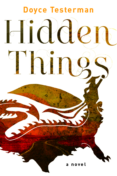
Now, it’s hardly a secret that I love this cover, in part because I had a lot of input into the sort of elements I thought should go into the thing. My understanding of the publishing industry (confirmed by many) tells me that having anyone ask the author what they think the cover should look like is a pretty unusual thing and I sent a lengthy email capitalizing on that chance. Thus, I am doubly lucky, first to have been asked, and then to have my input interpreted by someone who is very clearly pretty damned good at their job.
So that may make this contest seem a bit crazy and stupid, to which I can only reply: “It definitely is, and it definitely is not.”
The Contest:
Here’s what I want you to do.
Design a cover for Hidden Things.
That’s it.
Any style, any medium. It can be something completely different, or more of an homage to the official design, or whatever. Sculpt in clay. Use mad Photoshop skills. Snap a picture of a chalk drawing on the sidewalk with your smart phone — I DON’T CARE.
It certainly doesn’t have to be serious — I have a cover already, people — in fact I might give a special prize for the funniest and/or very worst submission. Have some fun, people: make something.
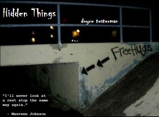
Once you’re satisfied, email me a picture (or video, or flash file, or… whatever) of your submission to doycetesterman@gmail.com or post it to my Facebook wall or on G+ or on Twitter, and draw my attention to it somehow.
You have until August 18th.
No, that is not a lot of time. Yes, that means it can’t be perfect. That is rather the point.
But wait…
Many of you will be saying “Um… Doyce? I don’t know anything about the book, really.” And you’d be right.
So here’s what I’m going to do.
At the end of this post, I will include the exact same email that I sent to my amazing editor when she asked me for cover ideas. If that isn’t enough for you, ask questions in the comments section.
I will have at least three ARCs to give away for this (including ‘cover that made me laugh hardest’), so your odds are… not terrible!
And Now, the Email
Hi Guys,
I’ve attached some images to go along with various thoughts I’ve had about the cover. I see a couple ways it could go (and I’m sure there are many others), so here are a few photos and ideas.
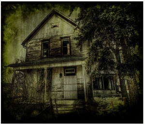
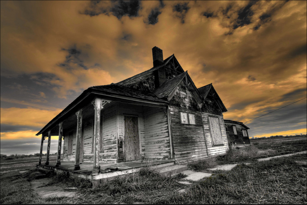
1. Creepy Abandoned House
This is the idea where the cover shows us the setting for some of the significant scenes, and focuses on creepy, melancholy abandoned farmhouses. Bob Merco is a photographer from Colorado who likes to do these sorts of shots, and while I’ve never met him, I imagine we’d get on fairly well — if nothing else, I like his photos.
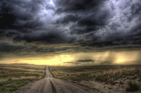
2. Long Road Home
In this concept, the focus is on the open stretches of the midwest and the long road home, but still with a bit of a focus on potentially surreal imagery. Only one image here, but I think it conveys the general idea.
A potentially interesting thing here it to take the basic picture and kind of cover it in scribbles that suggest an entirely different landscape.3. Modified Map
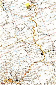
Graphically, this is the hardest to do, I think. The idea is to take a basic road map and scribble over it the same way as [SPOILERS] just before Calli [SPOILERS]. I’m no good at graphic design, but I’ve included a map that looks ripe for scribbling.4. Word Puzzle
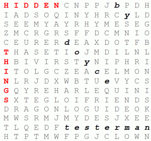
On it’s own, I don’t know if this conveys the feel of the story very well, but I still really like it and the scene it’s from, and if it’s not the cover, I would LOVE for it to be the interior cover page [Doyce’s Note: It is!] , so I can scribble on it and circle important words when I sign books. Which important words? Well, there’s twenty-three in the puzzle, all related to the story in some way.
5. Word Puzzle plus an Image
Now, while the puzzle itself doesn’t make a terribly compelling/accurate cover by itself, I saw a movie poster not that long ago that gave me an idea for taking some other image and overlaying that over the text, which I think actually WOULD be kind of cool, if the image behind it was appropriately creepy/spooky. I’ve attached the movie poster, so you can see what I’m talking about.And aside from that? Sidewalk chalk drawings. Creepy kid’s crayon sketches… there’s lots of different things that would work, depending on what your art people are into. I’m open to whatever, as they are undoubtedly much better at this than I am.
Cheers.
That’s it. Have at it!
